A well-structured HTML email is built on three things: a centered table wrapper set to ~600px, modular section blocks stacked vertically, and table-based columns instead of CSS flexbox or grid. The ~600px width fits the preview pane in most desktop clients without clipping. Section blocks (preheader, header, hero, body content, CTA, footer) keep each piece of your email isolated so one section can’t break another. And tables remain the safest layout primitive because Outlook’s desktop versions use Microsoft Word’s rendering engine, which ignores CSS widths and paddings applied to <div> elements (Litmus documents this directly: “Outlook will ignore most styles that you apply to your <div> tags including widths and paddings, so it’s important that you use <table> tags for your content instead”).
Once you have that skeleton, making it responsive and applying visual design are separate concerns. For responsive techniques (media queries, fluid hybrid, stacking), see How to Build a Responsive HTML Email Template. For typography, color, and visual hierarchy, see Email Design Best Practices for Developers and Marketers.
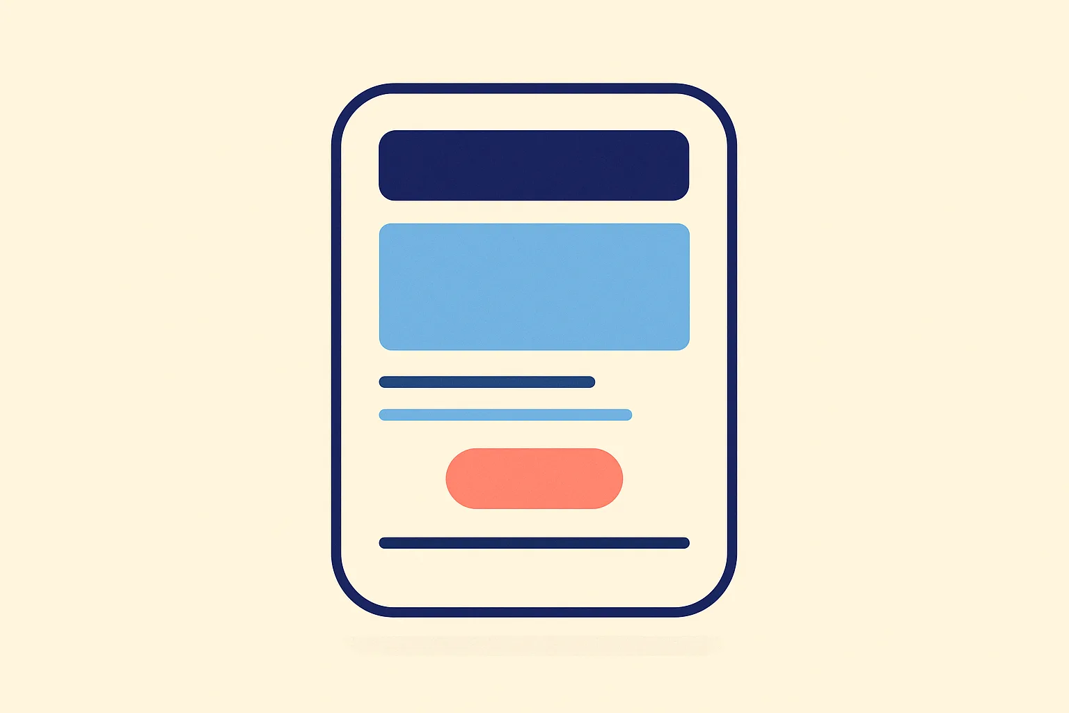
The Anatomy of an Email Layout
Every HTML email is a vertical stack of sections. These are the standard blocks, top to bottom:
| Section | Purpose | Notes |
|---|---|---|
| Preheader | Preview text in the inbox pane | Hidden visually; 40-130 characters (Email on Acid) |
| Header / Logo | Brand identity, top navigation (rarely) | Centered table cell; keep height under 100px |
| Hero | Primary image or headline visual | Full-width image inside a table cell |
| Body content | Text, product blocks, feature rows | One or more section tables, stacked |
| CTA | Primary call-to-action button | Table-based bulletproof button |
| Footer | Unsubscribe link, legal, social icons | Required by CAN-SPAM / GDPR |
The preheader is easy to forget but matters: it’s the first line of copy a recipient reads before opening. Code it as a visually hidden <span> at the top of the <body>:
<span style="display:none !important; visibility:hidden; mso-hide:all;
  font-size:1px; line-height:1px; max-height:0; max-width:0;
  opacity:0; overflow:hidden;">
  Your 40-130 char preview text goes here.
</span>
The mso-hide:all property hides it in Outlook specifically. The rest of the properties handle other clients.
Why Tables, Not Divs
CSS flexbox and CSS grid are only partially or conditionally supported across email clients. The Campaign Monitor CSS Support Guide tracks this in detail, and caniemail.com puts CSS display:grid at roughly 82% support, meaning about one in five email clients may not render a grid-based layout as intended.
The bigger issue is Outlook. Desktop Outlook (versions 2007 through 2021) renders HTML using Microsoft Word’s engine, not a browser engine. Word ignores CSS widths and paddings on <div> tags entirely. According to Email on Acid’s guide to the Word rendering engine, developers must use MSO-specific properties and conditional comments as fallbacks. Tables avoid this problem because the Word engine does honor table cell sizing.
The new Outlook for Windows (2023+) replaces Word with a web-based rendering engine and Email on Acid confirms this will improve CSS support considerably. But Office 2021 (the last Word-engine version) reaches end-of-support on October 13, 2026 (Microsoft Lifecycle), so word-engine Outlook will still be in use through that date. Per Litmus’s email client market share data (May 2026), Outlook accounts for 6.49% of all email opens. Small but real, especially in B2B.
Tables stay until the installed base clears.
The Standard Layout Skeleton
Here is a copy-pasteable HTML boilerplate for the outer wrapper. Everything else nests inside this:
<!DOCTYPE html>
<html lang="en">
<head>
  <meta charset="UTF-8">
  <meta name="viewport" content="width=device-width, initial-scale=1.0">
  <title></title>
</head>
<body style="margin:0; padding:0; background-color:#f4f4f4;">

  <!-- Preheader -->
  <span style="display:none !important; visibility:hidden; mso-hide:all;
    font-size:1px; line-height:1px; max-height:0; max-width:0;
    opacity:0; overflow:hidden;">Preview text here.</span>

  <!-- Outer wrapper table -->
  <table role="presentation" width="100%" cellspacing="0" cellpadding="0"
         border="0" style="background-color:#f4f4f4;">
    <tr>
      <td align="center">

        <!-- Content wrapper: 600px max -->
        <table role="presentation" width="600" cellspacing="0" cellpadding="0"
               border="0" style="max-width:600px; width:100%;
               background-color:#ffffff;">
          <tr>
            <td style="padding:24px;">
              <!-- Section content goes here -->
            </td>
          </tr>
        </table>

      </td>
    </tr>
  </table>

</body>
</html>
Two things to note: role="presentation" tells screen readers to skip the table’s layout role. width="600" is the HTML attribute (honored by Outlook); max-width:600px in inline CSS handles modern clients that respect CSS.
Single-Column vs. Multi-Column Layouts
| Layout | Best for | Mobile behavior |
|---|---|---|
| Single column | Long-form content, newsletters, transactional email | Naturally readable; no stacking needed |
| Two columns | Product grids, feature comparisons, image+text pairs | Must stack vertically below ~480px |
| Three columns | Thumbnails, icon rows | Stacks poorly; avoid for text-heavy content |
| Hybrid | Mixed content types in one email | Requires more testing; works well when sections vary |
Campaign Monitor notes that multi-column designs adapt well to different devices when built responsively, but single-column layouts are the simpler and more reliable path for mobile. The right choice depends on your content: transactional emails and lifecycle sequences almost always stay single-column; product marketing emails often benefit from a two-column product grid.
A Two-Column Block That Stacks on Mobile
This pattern uses a nested table for columns. Each column is its own <td>. A media query (in a <style> block in the <head>) collapses them to 100% width on small screens. For clients that strip <head> styles, the columns fall back to whatever their HTML width attribute allows:
<!-- Two-column section -->
<table role="presentation" width="100%" cellspacing="0" cellpadding="0" border="0">
  <tr>
    <!-- Left column -->
    <td class="col" width="48%" valign="top"
        style="padding:12px; width:48%; display:inline-block;">
      <p style="margin:0;">Left content here.</p>
    </td>

    <!-- Right column -->
    <td class="col" width="48%" valign="top"
        style="padding:12px; width:48%; display:inline-block;">
      <p style="margin:0;">Right content here.</p>
    </td>
  </tr>
</table>
And in your <head> (inside a <style> tag):
<style>
  @media only screen and (max-width: 480px) {
    .col {
      width: 100% !important;
      display: block !important;
    }
  }
</style>
For a full breakdown of responsive stacking techniques including fluid hybrid and display:inline-block patterns, see How to Build a Responsive HTML Email Template.
Bulletproof Buttons and Spacing
Avoid using <a> tags styled as buttons with padding. Outlook’s Word engine ignores padding on inline elements. Use a table cell instead:
<!-- Bulletproof CTA button -->
<table role="presentation" cellspacing="0" cellpadding="0" border="0">
  <tr>
    <td style="border-radius:4px; background-color:#4F46E5;">
      <a href="https://example.com"
         style="display:inline-block; padding:14px 28px;
                font-family:sans-serif; font-size:16px;
                color:#ffffff; text-decoration:none;
                font-weight:600;">
        Get Started
      </a>
    </td>
  </tr>
</table>
The background color and border-radius go on the <td>, not the <a>. Outlook renders the cell background correctly even when it can’t handle the anchor’s inline padding.
For vertical spacing between sections, use empty table rows with explicit heights or add padding to table cells. Avoid CSS margin between block elements for spacing as Outlook handles margin on <div> elements inconsistently.
Dark Mode Considerations for Layout
Dark mode affects email layout in one key way: background colors you set in <body> and outer table cells may get overridden by the email client. Apple Mail, Gmail (Android/iOS), and Outlook mobile all handle dark mode differently.
The structural fix: set explicit background colors on every section table cell, not just the outer wrapper. If only the outer <body> has a background, an email client applying dark mode will invert the body but leave inner sections transparent, which creates unintended dark backgrounds showing through.
Use prefers-color-scheme: dark in your <head> styles to supply explicit overrides:
@media (prefers-color-scheme: dark) {
  .email-body { background-color: #1a1a1a !important; }
  .content-cell { background-color: #2d2d2d !important; color: #e8e8e8 !important; }
}
Set class names on the table cells (not just inline styles) so the media query can target them with !important. Inline styles win by default in email, so !important in the <head> style block is needed to override them in dark mode.
Building with Components Instead of Hand-Coding
If you prefer building email layouts as composable components rather than raw HTML tables, React Email provides layout primitives (<Html>, <Body>, <Container>, <Row>, <Column>) that compile to table-based HTML. The output follows the same table-based skeleton described in this post, but you write it in JSX.
When you’re ready to send the finished email, How to Send HTML Email (the Right Way) covers MIME structure, inline CSS tooling, and API-based delivery. Coldletter’s template editor also handles table-based layout for you visually while keeping the underlying HTML standards-compliant.
Frequently Asked Questions
Why do HTML emails use tables instead of CSS flexbox or grid?
Desktop Outlook versions 2007 through 2021 use Microsoft Word’s rendering engine, which ignores CSS widths and paddings applied to <div> elements. Tables are the reliable alternative because the Word engine does honor table cell sizing. Even though CSS grid now has roughly 82% support across email clients (caniemail.com), the remaining gap and Outlook’s large installed base make tables the safest structural foundation.
What is the standard email width and why is it 600px?
600px became the standard email content width because it fits comfortably within the reading pane of most desktop email clients without horizontal scrolling. It also scales down gracefully on mobile. While modern monitors and clients could support wider layouts, 600-640px remains the industry standard because it is battle-tested across the widest range of clients.
What is the difference between email layout and email design?
Layout is the structural skeleton: the wrapper table, section blocks, column arrangement, and how elements are positioned. Design covers the visual layer on top: typography, color palette, spacing ratios, and imagery. Layout is mostly HTML table structure; design is mostly CSS. They are separate concerns, which is why changing a logo color should not require rebuilding your table structure.
When should I use a single-column layout vs. a multi-column layout?
Single-column layouts work well for transactional emails, long-form newsletters, and lifecycle sequences where a clear reading order matters. Multi-column layouts (two or three columns) suit product grids, feature comparison rows, and image-heavy promotional emails. If you use multi-column, ensure columns stack to full-width on screens narrower than ~480px. When in doubt, single-column is simpler to maintain and more reliably mobile-friendly.
What is role="presentation" on email tables?
Adding role="presentation" to layout tables tells screen readers (and accessibility tools) that the table is being used for visual layout, not to represent tabular data. Without it, screen readers may announce table navigation cues (“row 1 of 3, column 2 of 2”) for every layout section, which is confusing for visually impaired recipients. It is a low-effort accessibility improvement on every layout table.
How do I prevent Outlook from adding unwanted spacing around images?
Outlook’s Word engine adds extra spacing below inline images by default, treating them as inline text with a text descender. Fix this by adding display:block and line-height:0 to the containing table cell, and set border:0 on the <img> tag itself: <img src="..." style="display:block; border:0;" />. Without these, you may see small gaps below images in Outlook that don’t appear in other clients.
I’ve spent my career building software at scale with a soft spot for email: deliverability, lifecycle campaigns, and getting messages to actually land. I started Coldletter to fix what bugged me about transactional and marketing email tools. I’m based in Vancouver.